The corporate image will be created from the choice of the logo.
 It will represent the entity of the Optometrists Opticians Association in the Canary Islands, for the choice has to be taken into account:
- simplicity
- economy
- versatility
The logo will represent a group that takes off from National Association to begin a journey on its own. It seeks to economize the cost of using the logo for corporate image, so the starting point is that there is a clear contrast with standardized base paper (white) using a maximum of two colors. Thus the tone in which we operate are the black and blue (inherited from the National Association).
The form must be simple. Easily recognizable, drawable by anyone, visually striking and easy to remember.
It has to solve some real corporate image needs, as envelopes, papers, website, seals for stamping, cards and even future self-promotion of the members entity's own optical, sponsoring events, effects related materials or corporate gifts.
Recognition must be achieved immediately. The entity that represents, as well as their values and professionalism must easily come on mind.
The logo will be the ambassador of the principles and quality throughout the organization wants to convey.
Proposal
Logo consultancy
Team:
Marta Castrillón


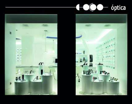
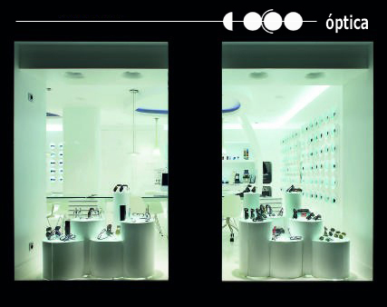
A selection of projects
© ARKTEKTUR 2014. All rights reserved.
LOCATION
Bispevangen 156
DK-2750 Ballerup

LOCATION
Bispevangen 156
DK-2750 Ballerup
